Managing Housing Expectations for Refugees - Animated Explainer Film for the UK Refugee Council
THE DESIGN PROCESS
This was a long form animation compared to my usual motion graphics gigs, so here I will detail my design process, from pitch to the final cut.
STAGE 1 - THE PITCH
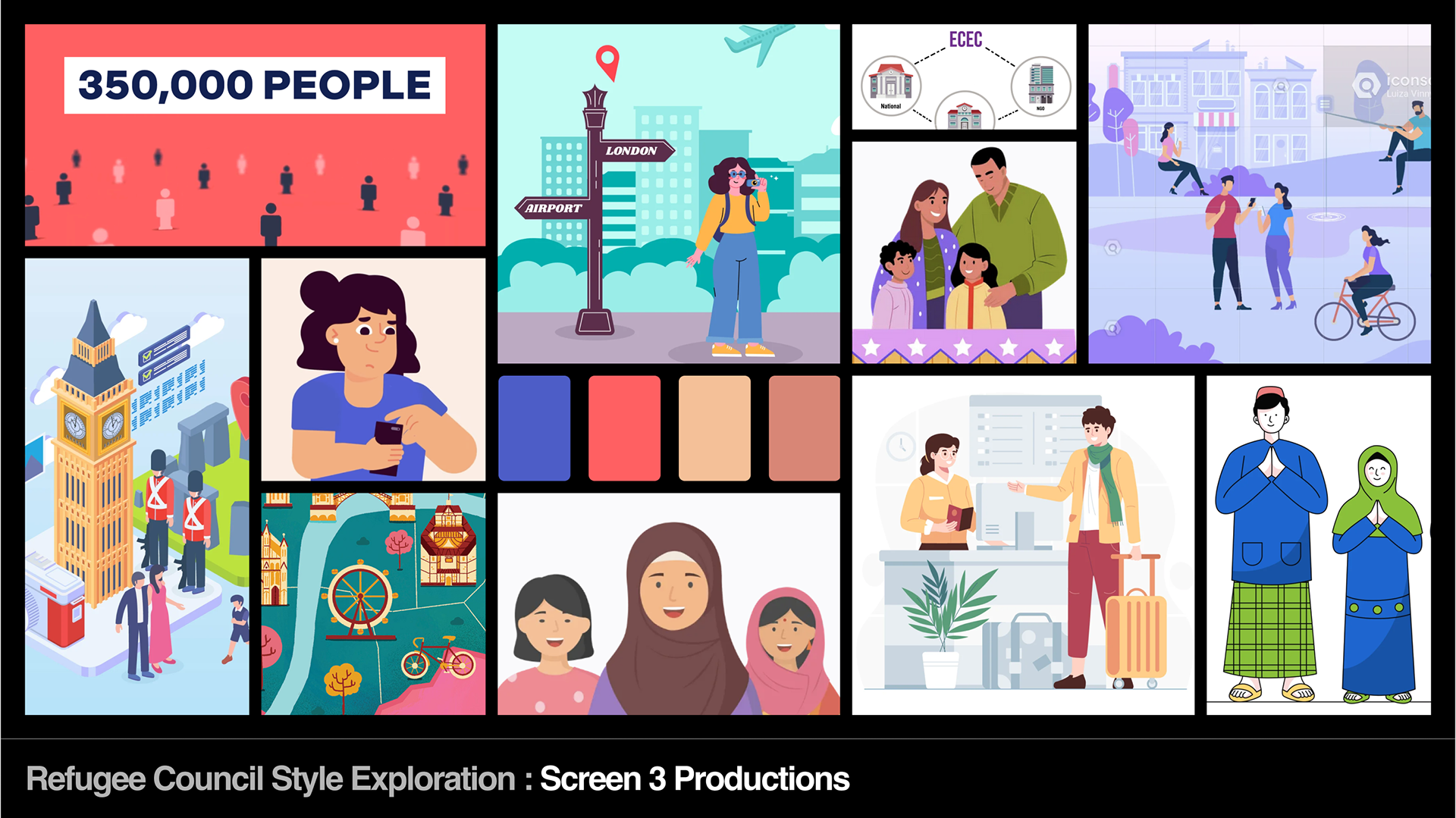
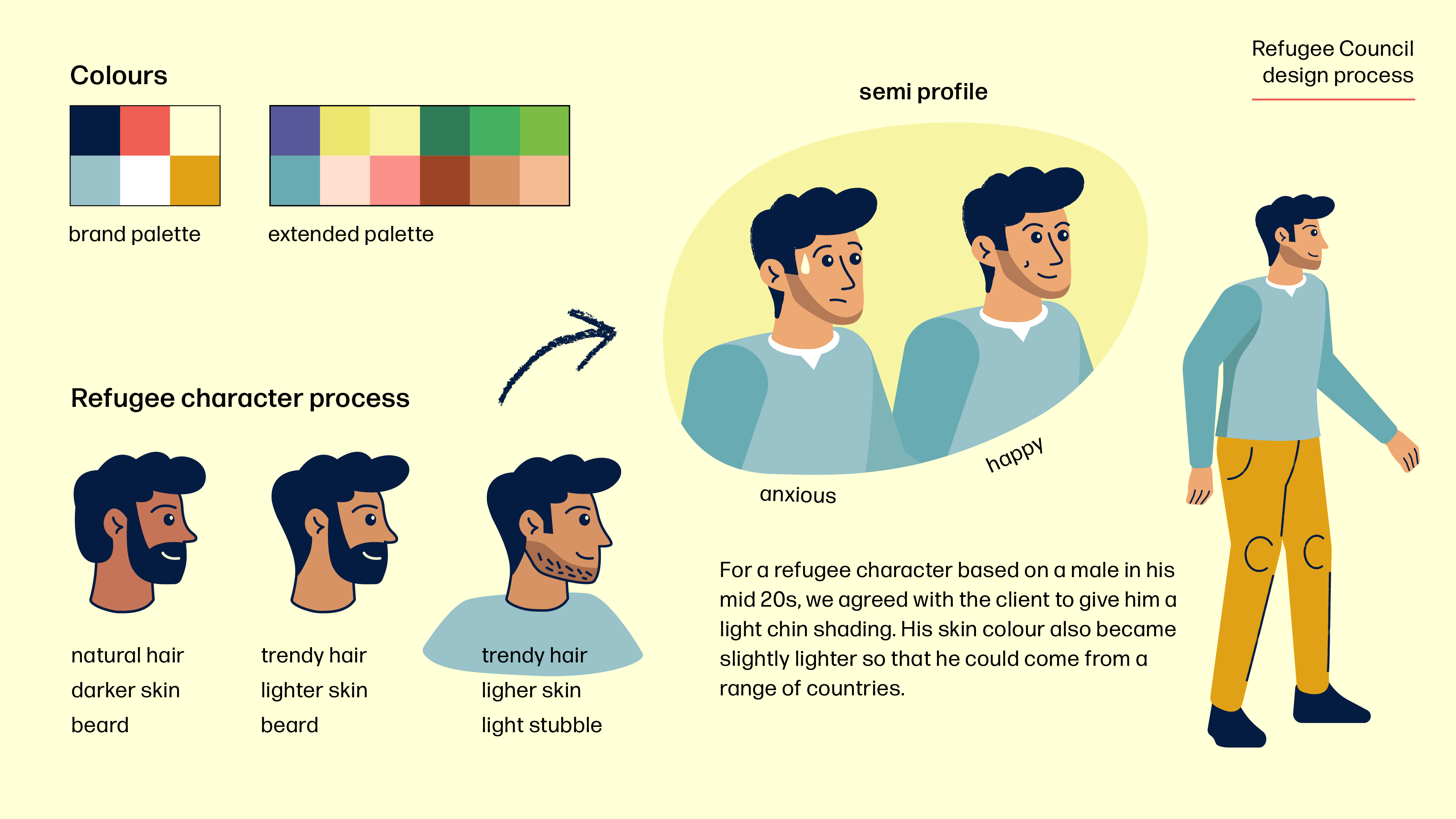
Andy Oxley, the director of Screen 3 Productions sent me a script from the Refugee Council and asked me if I wanted to pitch for it. I read the script and read through the visual ideas they had for each scene, adding my own notes. I then put together a visual moodboard based around illustrated images of diversity, London settings and travel. I came up with a suggested colour palette: blue and red (Union Jack British colours), and two earth colours to represent refugees from the Middle East. Later, on seeing the Refugee Council's brand guidelines I had a fixed colour palette to work with, which I extended. Fortunately their colours included a similar red and 2 shades of blue.
The effort I put in did the trick, and based on our final presentation and work samples we won the pitch!
STAGE 2 - STORYBOARD
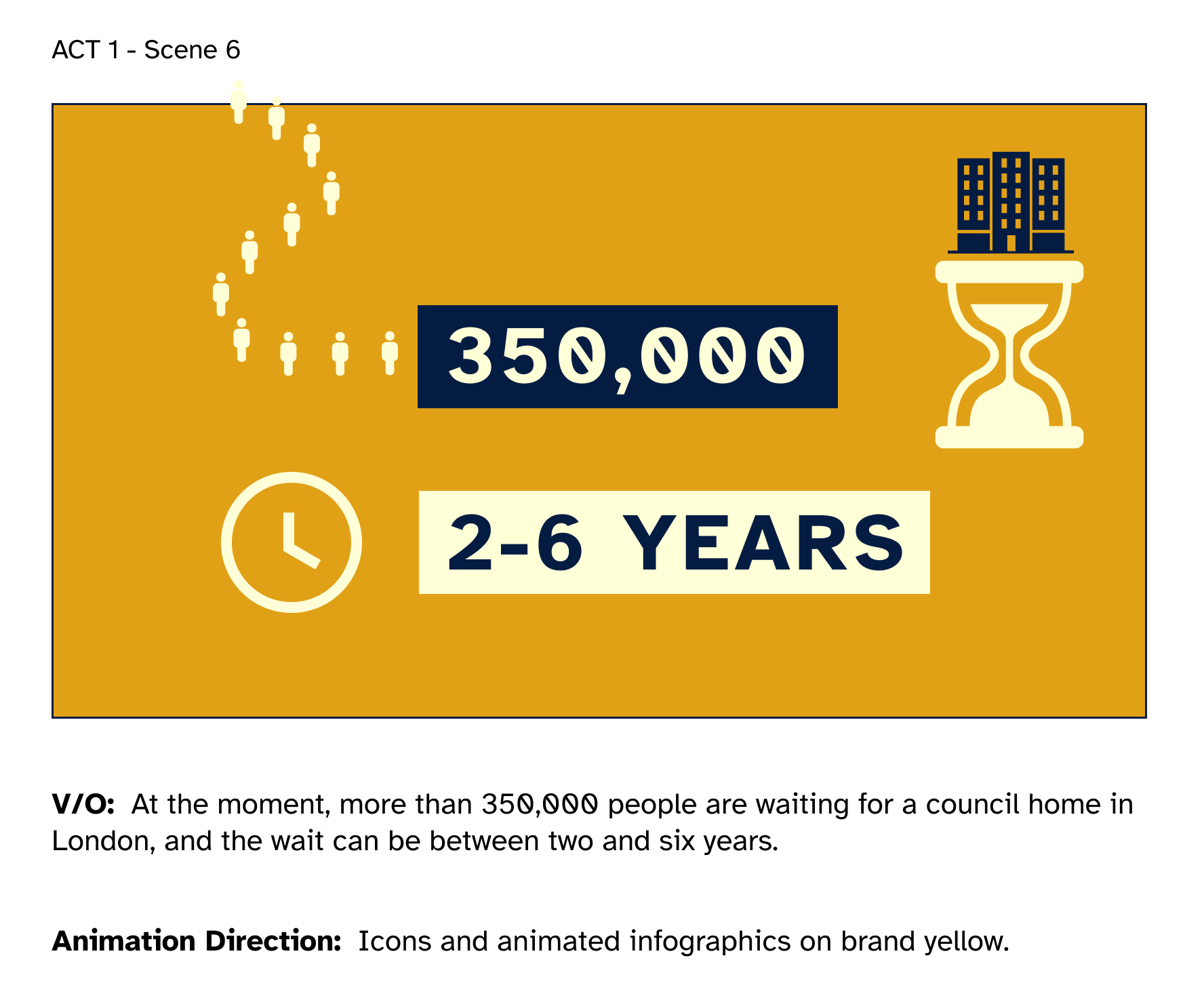
The film had many scenes set across London and the UK, including many maps and infographics. To put down my initial scene ideas I used Figma to make a bare bones storyboard. The frame below used icons and stat bars to get across the basic concept of waiting times. See how the infographic changed in one of the slides below.
STAGE 3 - STYLE TESTS
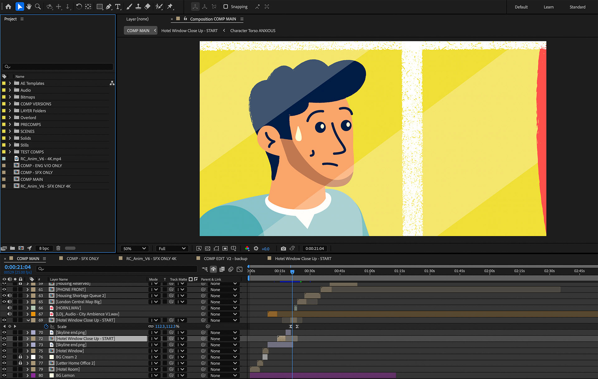
STAGE 4 - THE CHARACTER
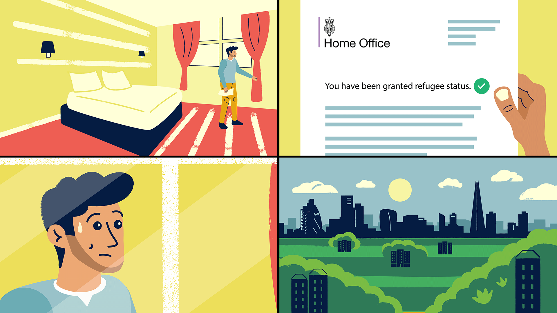
Here is the progression of the refugee character who starts off anxious about his future after receiving his refugee status letter. We went through this process very quickly with the client with their positive feedback and blessing. His outfit is in the pastel colours from the Refugee Council's brand guidelines.
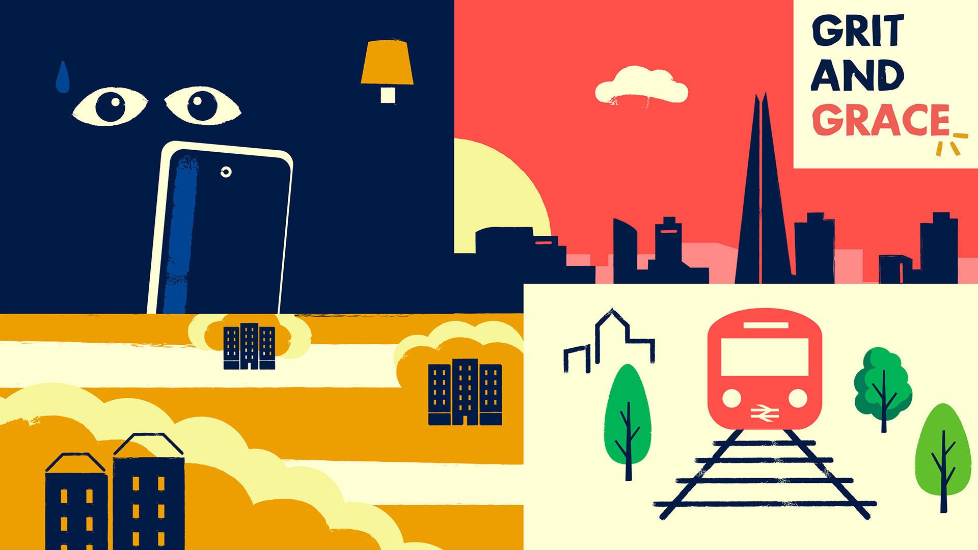
Animation stills: Asylum hotel scenes. Here I started by drawing the hotel scene and a view of the London skyline in the brand's colours. I used artistic license for the Home Office 'refugee status' letter because this was very plain in reality. With an explainer film one needs to get the message across clearly and visually, and icons help to achieve this quickly.
Animation stills: London scenes, the rental market and the cost of living being much cheaper outside London in other UK cities (as well as beign just as diverse).
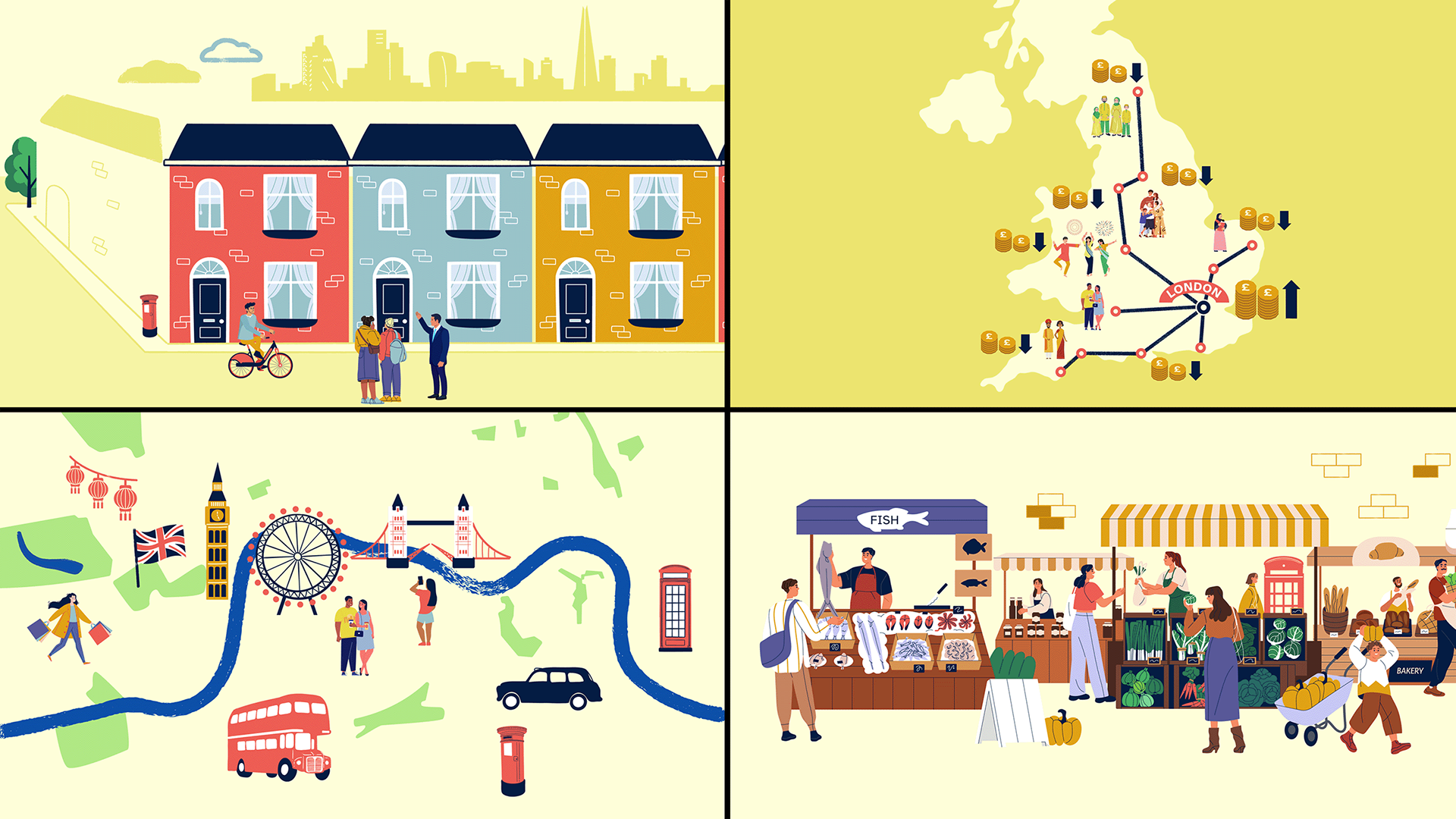
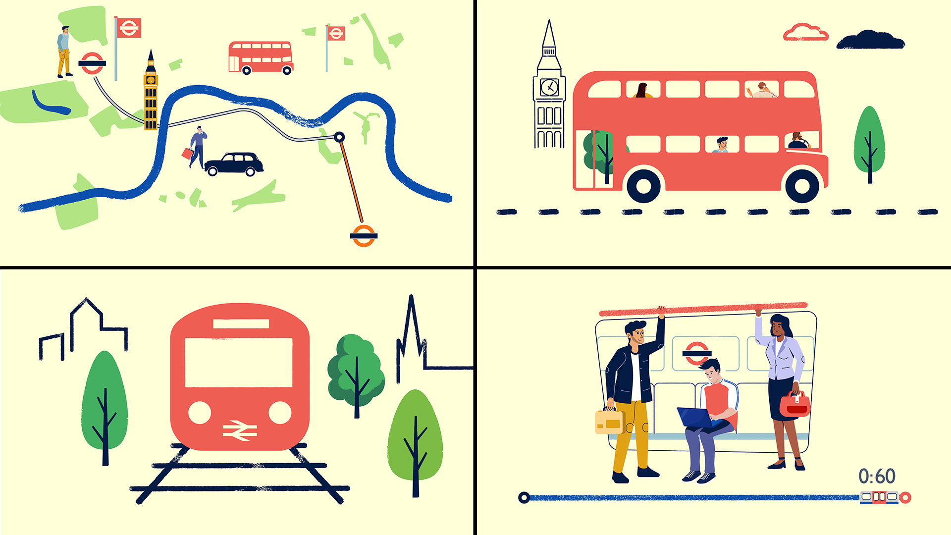
Animation stills: Modes of transport in London. Note here that I used icons from the Noun Project as a starting point to build up sketchy scenes set in London.
Animation stills: The difficulty of obtaining council housing, renting in London, and the option of supported housing
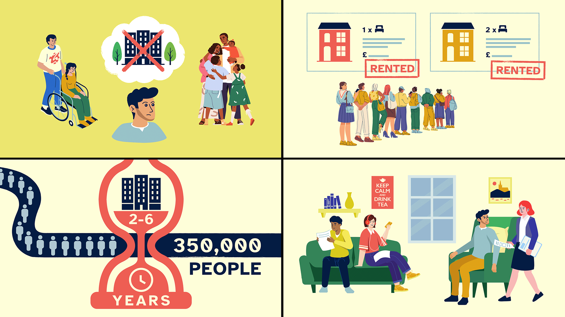
Animation still: A refugee is encouraged to consider the option of living in a shared rental house

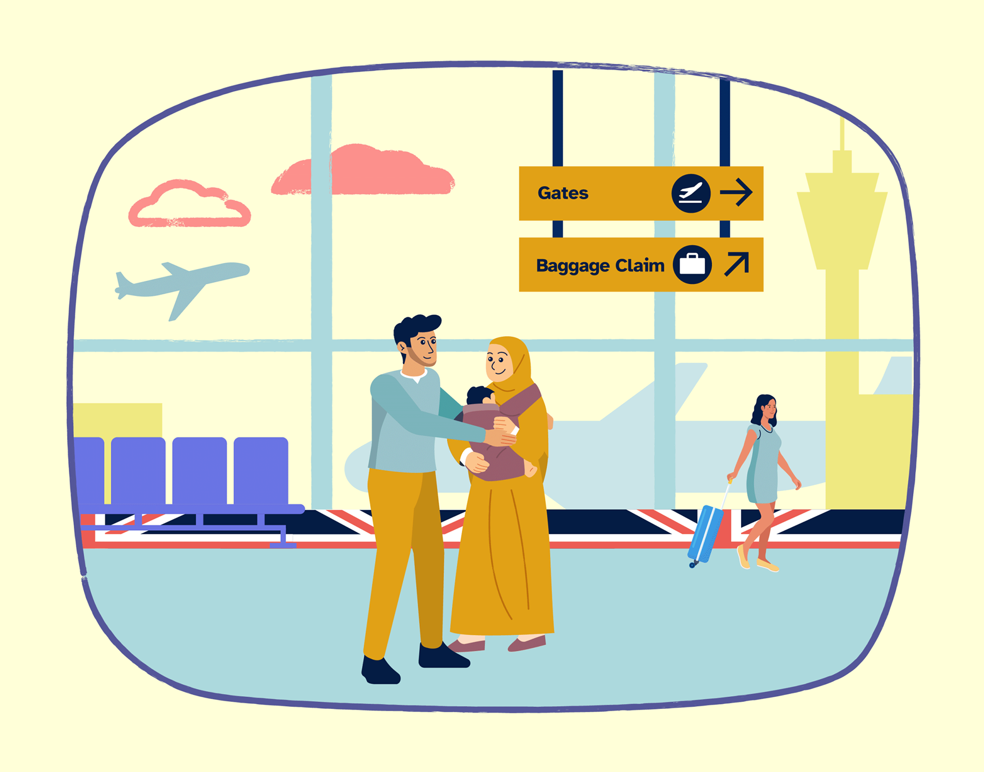
Deleted airport scene! I was very fond of this Heathrow arrival scene where our refugee is greeted by his wife and child. Sadly, due to a sudden change in UK policy, family reunion applications were suspended so the scene was cut.
A big thanks to Gavi and Natasha from the Refugee Council who trusted our creative direction from the start!
Client: Refugee Council UK
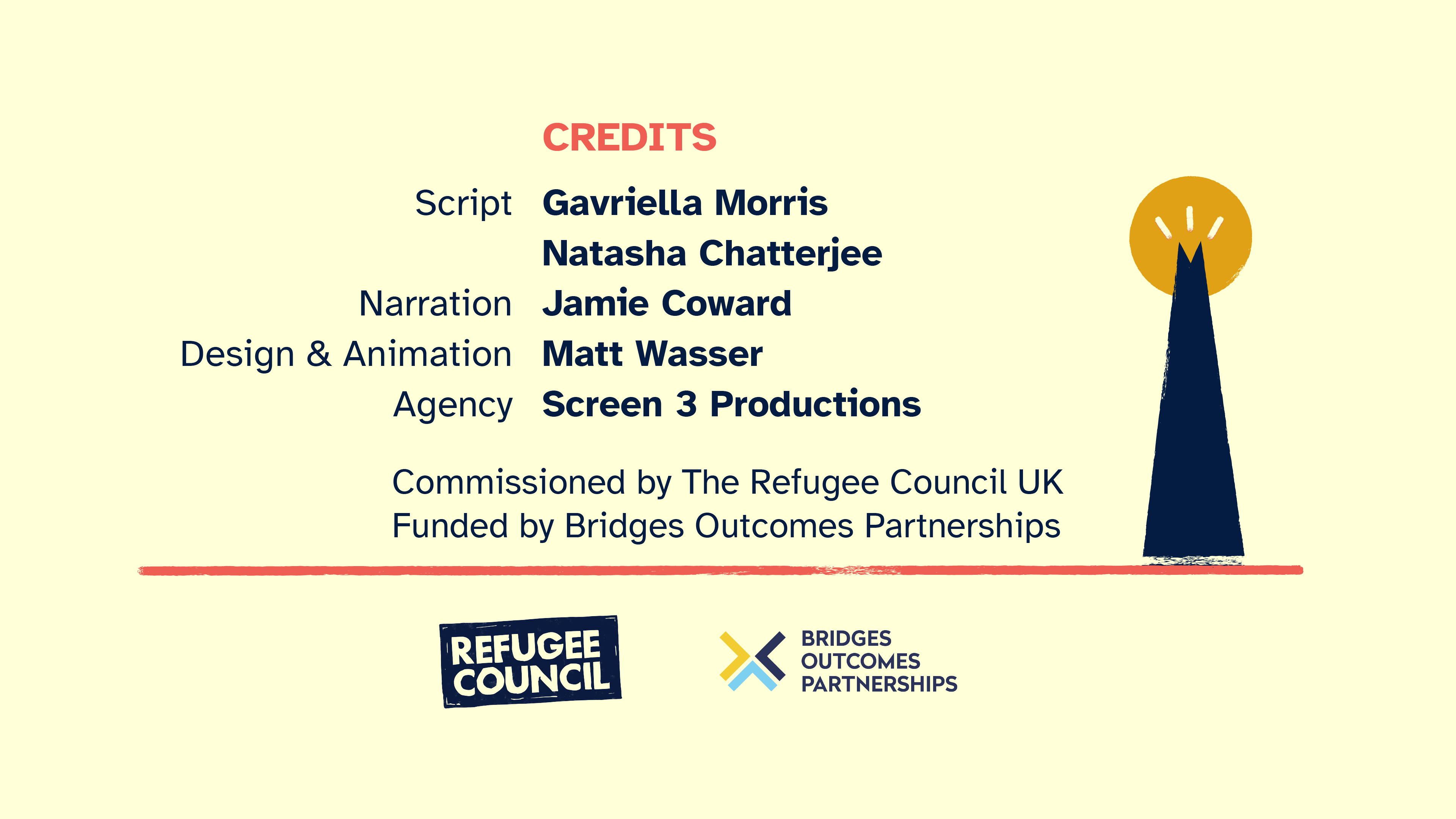
Script: Gavriella Morris and Natasha Chatterjee
Narration: Jamie Coward
Agency: Screen 3 Productions (video)
Design and Animation: Matt Wasser
V/O translations: Clearvoice
Script: Gavriella Morris and Natasha Chatterjee
Narration: Jamie Coward
Agency: Screen 3 Productions (video)
Design and Animation: Matt Wasser
V/O translations: Clearvoice
Funder: Bridges Outcomes Partnerships